

COLOUR KNOW-HOW
Why do my prints look darker than my screen?
Screen brightness, paper finish and colour profiles can change how an image looks. Here is what to check before brightening photos or AI artwork for print.
By the ArtFart team · Published · 5 min read
THE SHORT VERSION
Check your screen settings, the light around the print and the original file before making edits. There is no universal brightness adjustment that makes every photo or AI image print correctly.
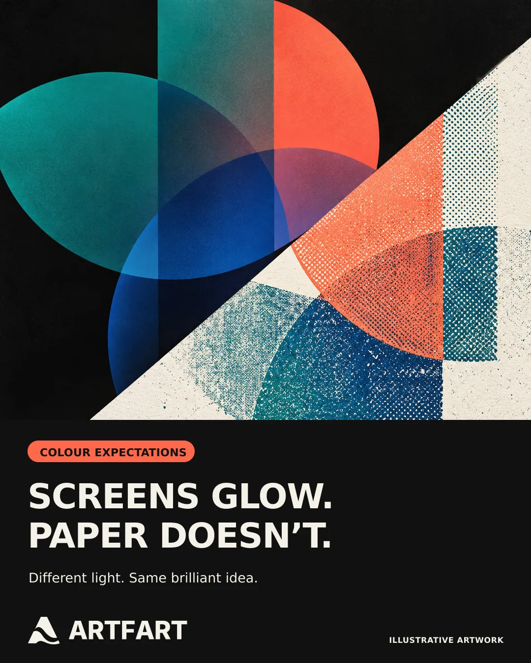
Screens glow. Paper doesn’t.
A phone or monitor produces its own light. A print reflects the light falling on it. That is why a picture that looks luminous on a bright screen can feel quieter on paper, especially in a dim room. Paper has many excellent qualities. A backlight is not one of them.
Brightness and colour are separate questions. An image can look darker overall, have an unexpected colour cast or lose some of the intensity of a particular colour. Those differences do not necessarily have the same cause. Start by identifying what looks wrong rather than adding brightness and saturation to everything.
Check your phone before changing the photo
Open the original image in a reasonably lit room. If you normally view everything at maximum screen brightness, bring it down to a comfortable level before judging the picture. There is no magic percentage that works across every phone, monitor and room. Moving a slider is a useful check, not a substitute for a calibrated display.
Temporarily turn off warm night-time display modes while checking colour. Apple’s Night Shift deliberately makes the display warmer. You can toggle it in Control Centre by holding the brightness control, or find it under Settings, Display & Brightness. This changes the way you see the screen, not the image file itself.
Check the exported file you intend to upload, not just the version inside your editing app. If they look different on the same device, pause and review your export settings before ordering. The print can only begin with the file you actually send.
Look closely at the dark bits
Night photographs, moody portraits and AI artwork with dramatic shadows deserve a careful look. Can you distinguish the subject from the background? Is there useful detail in dark clothing, hair or foliage? A strong silhouette may be deliberate. A face that disappears may be less intentional.
If the image needs editing, work on a copy and keep the original. Consider a gentle adjustment to the shadows or midtones rather than simply making the entire image brighter. Watch pale skies, white clothing and bright lights as you edit so that rescuing the shadows does not flatten the highlights.
Avoid a blanket rule such as brighten every file by 20%. A sunny beach photograph and a salt-flat racer at night are doing rather different jobs. Neither benefits from being forced through the same correction because the internet sounded confident.
Does semi-gloss or matt paper change the result?
The surface is part of how you experience a print. ArtFart’s 250gsm Semi Gloss is smooth with a slight shine. Ultrasmooth fine art paper is smooth with a matt finish. Satin Canvas has a subtle canvas finish. Choose the surface for the image and where you plan to display it.
A slight sheen can also catch reflections. Think about the position of windows and lamps, particularly if the finished print will sit behind glass. Matt paper does not remove reflections from the glazing in front of it.
Changing paper is not a reliable fix for an underexposed file. Compare the finishes on our papers page, then check the image itself. We supply prints without frames or mounts and our Satin Canvas is supplied unstretched, so consider that finishing stage too.
Keep colour information with the file
A colour profile helps compatible software interpret the colour values in an image. When your editor offers an option to embed the document’s colour profile on export, keep it included. Adobe explains that files without a profile can be interpreted differently by other applications, causing unwanted colour shifts.
Do not strip the profile or choose a random printer profile as a brightness fix. If you are unsure about export settings or need a particular colour reproduced closely, ask us before ordering. A thumbnail on a phone is not a colour reference.
What about vivid AI artwork?
AI images often lean into glowing skies, neon signs and wonderfully implausible lighting. Enjoy the drama, but inspect the actual downloaded file rather than judging only the generator’s preview. Check that the dark areas still have the separation you want and that the main subject reads clearly.
Resolution is another check entirely. Upscaling can increase pixel dimensions, but it is not a colour or exposure correction. Review brightness and composition separately from the size recommendation. Our AI print preparation guide walks through the wider file checks.
What if a delivered print still looks wrong?
Look at it in a well-lit room rather than under a single dim or strongly coloured lamp. Compare it with the same original file using sensible screen settings. If a dependable screen reference matters to your work, monitor calibration and a colour-managed workflow are the next step.
If there is an unexpected colour cast, missing detail or another concern, email info@artfart.co.uk with your order reference, the file you supplied and a description of the difference. A photograph of the print and its surroundings can help explain the problem, although a phone photograph is not an exact colour measurement. Do not assume every mismatch is normal or place another order with a heavily edited file before asking.
The quick check before you upload
Use the best original file. Check it with warm display modes off and sensible screen brightness. Inspect the shadows and highlights, save any edits as a separate version and retain the embedded colour profile where supported. Choose the paper finish, then check the crop and suitable print size.
If colour is critical, talk to us first. If you simply want a favourite photo or AI creation off your phone and onto a wall, these checks give it a more considered start. Your screen can go back to showing the weather afterwards.
Ready to make it real?
Upload your image and find the size and finish that work for it.
Upload Your ArtAsk the ArtFart teamA bit more know-how.
All guides →
How to scan old photos for printing
Turn an old family photograph into a printable file with sensible scanning, gentle editing and a print size that respects the detail in the original.
Read the guide →
Should I upscale my AI image before printing?
Learn when an AI image needs upscaling for print, what ArtFart’s 2× tool changes and which details to check before choosing the enlarged file.
Read the guide →